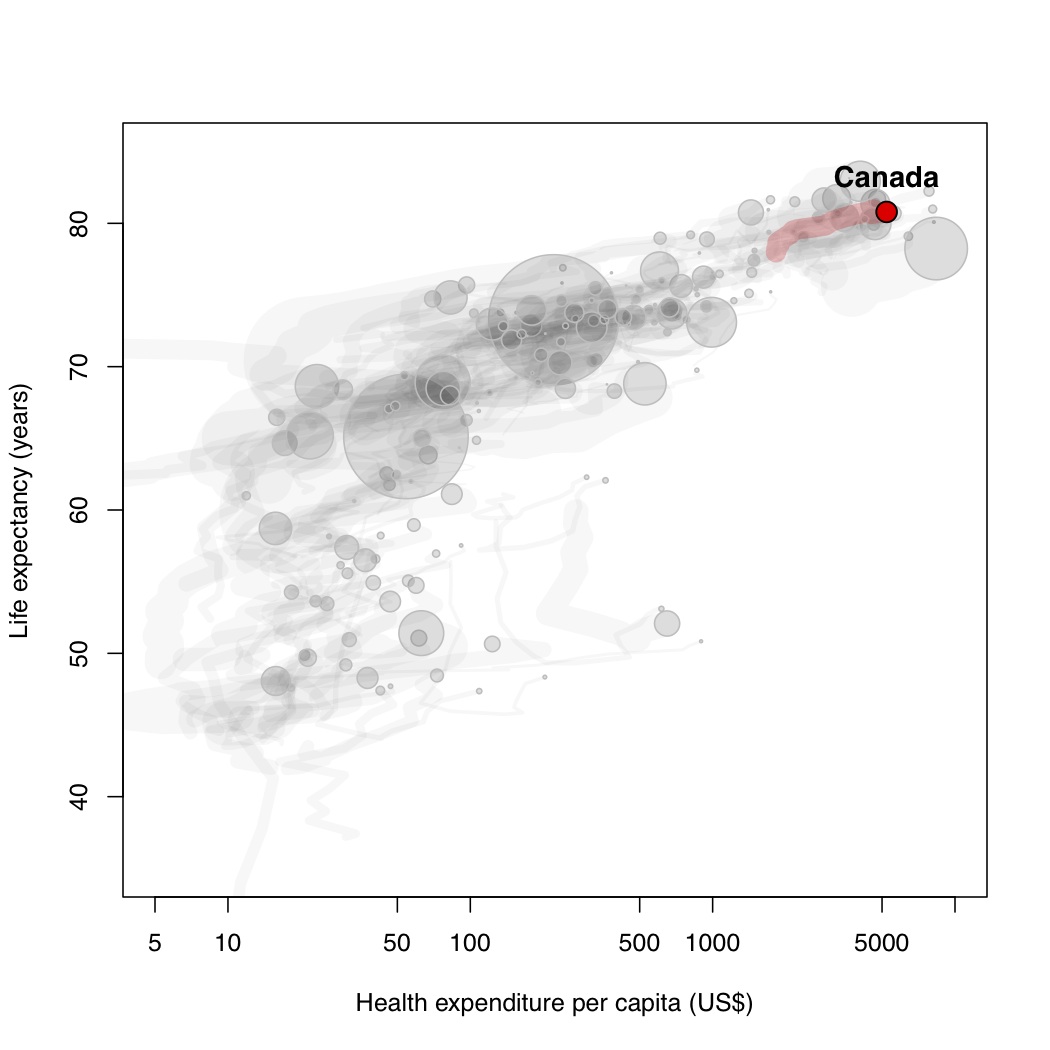
Well, this type of relationship has been shown beautifully by Hans Rosling. Animated and interactive figures are even available on his website and it is definitely worth exploring!
Gapminder
For the sake of learning and for the fun of it, I made my own (static) figure using R! This figure shows the association between life expectancy and per capita health expenses among countries (data up to 2010).
The general trend is increased spending and longer life expectancy but sadly, not all countries are on that path… Canadians are doing quite well!

